Samba Design System
Samba is Betterment’s design system for digital products and experiences. The system consists of working code, design tools, resources and guidelines.
Role Staff product designer
Company Betterment
Team 4 FE engineers, 1 designer

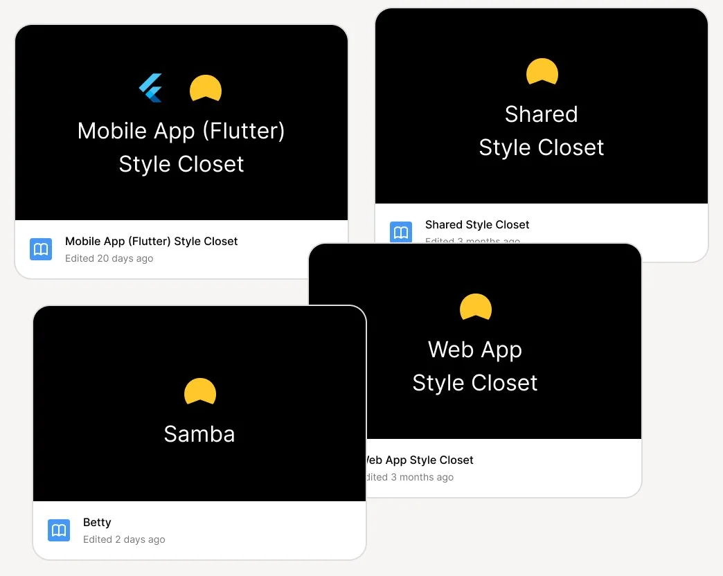
There are multiple Figma libraries. Designers didn’t know what is SoT.
When I joined Betterment, there were 4 different Figma libraries designers were pulling from. You might ask, “How did they get here?” Many attempts to overhaul and start fresh led to more unmanaged libraries. The design system effort either had too many owners or switched hands too many times, losing momentum with each shift.
Inconsistent designs
Designers would enable all libraries every time a new Figma file was created. They would pull from whichever libraries seemed to have what they needed. Designers would copy and paste from each other’s files, creating a cesspool of incorrect patterns and components.
Tension between design and engineering
Since designers were pulling from all libraries, there was inconsistency between what was available in design vs code. Designers weren’t aware of the code base for their projects (common with Rails vs React projects). This created a lot of tension during the build and UAT phase.

Teams hadn’t budgeted for a React switch
Some teams managed experiences that were built completely on Rails. Switching to React would be a huge effort that they had not budgeted for. There was also a React learning curve for engineers within those teams.
There are multiple front-end libraries
Our tech stack for front end engineering consisted of React, Rails and Flutter. Fortunately, mobile was solely built with Flutter. However, for web, depending on the team, some teams were using React and some were using Rails. There is an effort to move everything over to React, but this is an ongoing effort that will take much time.
Poor user experience due to load times
On pages that consisted of both Rails components and React components, certain parts of the page would load slower than others, causing a seemingly broken experience.
The solution
Create SoT design and front-end component libraries. Ensure parity between the two.
Deep dive with designers
I first checked the Figma analytics to see how components in each library were getting used, but I was coming up with more questions than I had answers. So I decided to just talk to designers directly about their whys, when’s, and where’s for each library.
Arbitrary usage of the systems
Most designers admitted to just pulling assets from whichever library appeared first in their component search. They would find out during the build phase if certain components used in their designs were or weren’t available in the code base their engineers were building in.
Usage of brand assets library
A couple of designers were using a brand asset library that was very different from the other libraries. It included brand and marketing assets, different color tokens, and brand fonts that were not owned by the Platform team and were out of scope for this project.
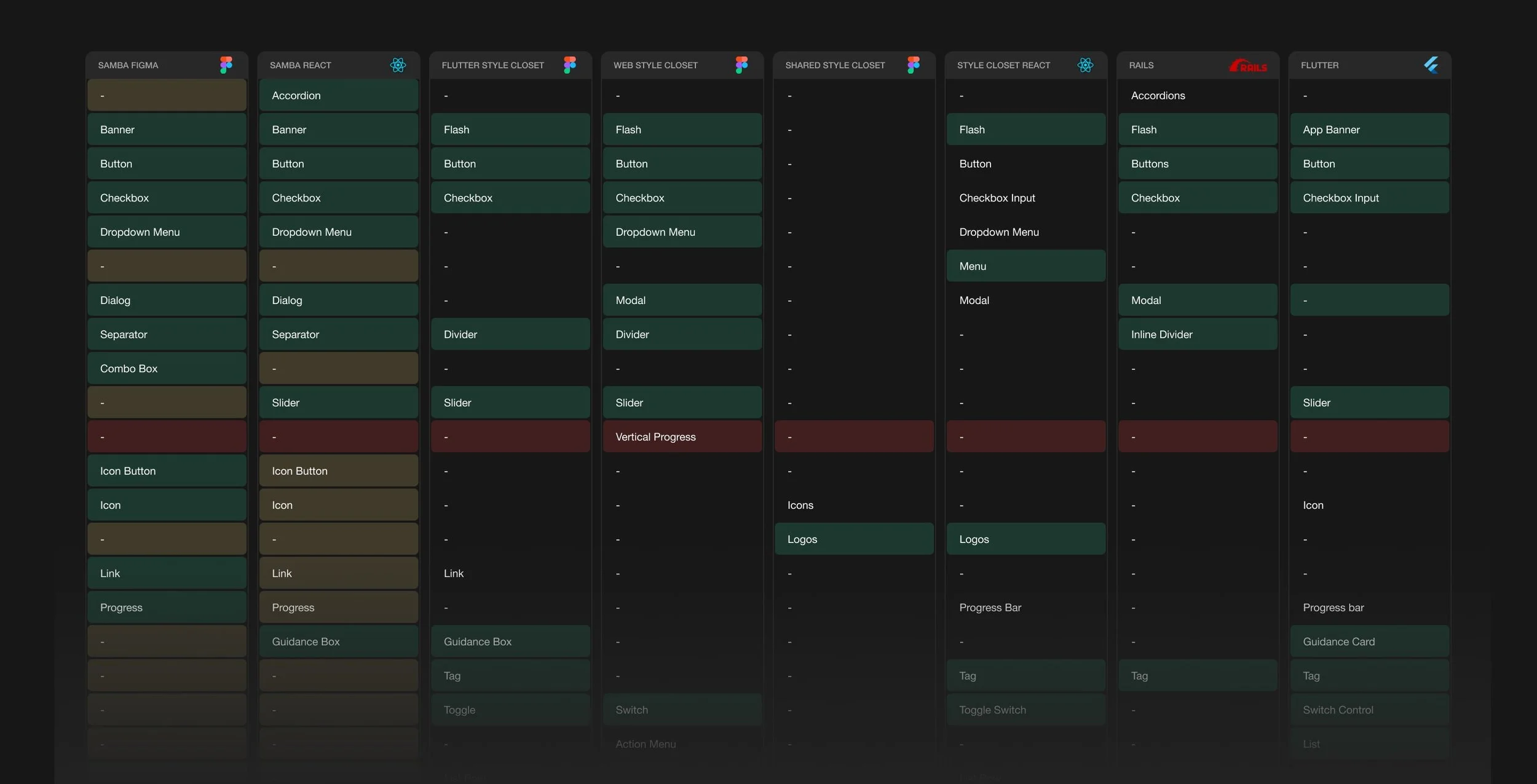
Conducting audits to identify gaps, overlaps and deprecations
I audited the Figma libraries and put together a Google Sheet to give myself a bird’s eye view. I conducted a similar audit on all the front-end libraries. There were two React libraries, one Flutter library and one Rails library. Across all libraries, I found completely different components and sometimes similar components with different names. Some libraries were also more mature than others. Ex: Flutter had dark mode tokens that React and Rails didn’t have. I used color to identify gaps, overlaps and deprecations between the systems..
The scope
Focus on a Figma library that has parity with a React front-end library.
Aligned Figma and React with Flutter tokens
With Flutter color tokens being a bit more mature than web, we decided to rename and/or remap our React tokens to align with Flutter tokens, creating a shared language and values for tokens across platforms.
Prioritize missing Figma components
With teams already building in React, this left me and Figma playing catch up to engineering. I quickly prioritized the Figma components based on level of effort and design needs.
Checked components for consistency
Components that were supported across multiple libraries (design and front-end web) would continue to be supported and were checked to make sure their variants and properties were consistent across the different libraries.
Deprecation and replacement strategies
StyleCloset React components were given replacement strategies. Rails teams were not scheduled to switch to React, but the Samba team found an interim solution to support the Rails teams by updating Rails tokens instead of a full switch.
React and Figma Parity
Engineers used other open source component libraries such as Radix, React Aria, Shadcn/ui as a basis for how we build components while they were waiting for the Figma library to be built. These open source libraries supported a lot of the components Betterment needed currently and for future scaling of the system.
I built my Figma components with a similar structure that mirrored (as much as possible) their React implementation.


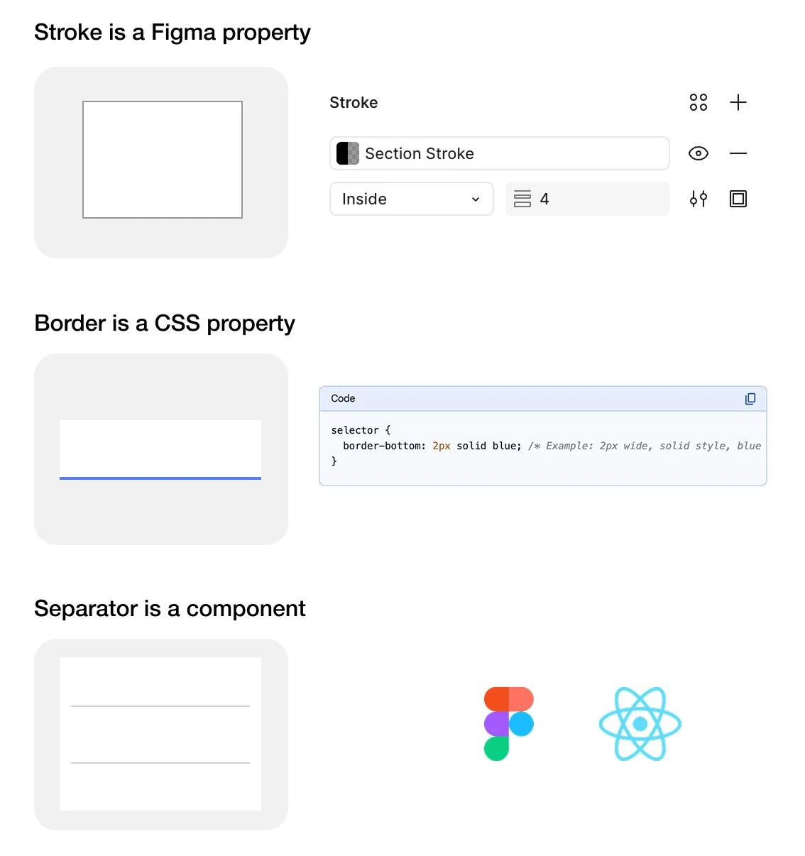
Shared language and structure
Oftentimes, designers have a way of naming things that is very different from engineers. Part of my efforts was to use the Figma system as a way to educate designers on engineering language so they can better understand the final output of their designs.
This meant referring to things in Figma in the same way they are referenced in React or Flutter. This also meant referring to certain Figma props and variants in the same way they are referenced in React.
Publishing the System
After creating Figma equivalents for React components and stress testing with a few designers, I released the new design system to the entire design team and captured what was added, updated and removed in release notes. This Figma release was communicated to both the design and engineering teams via Slack and team meetings.


Post release questions
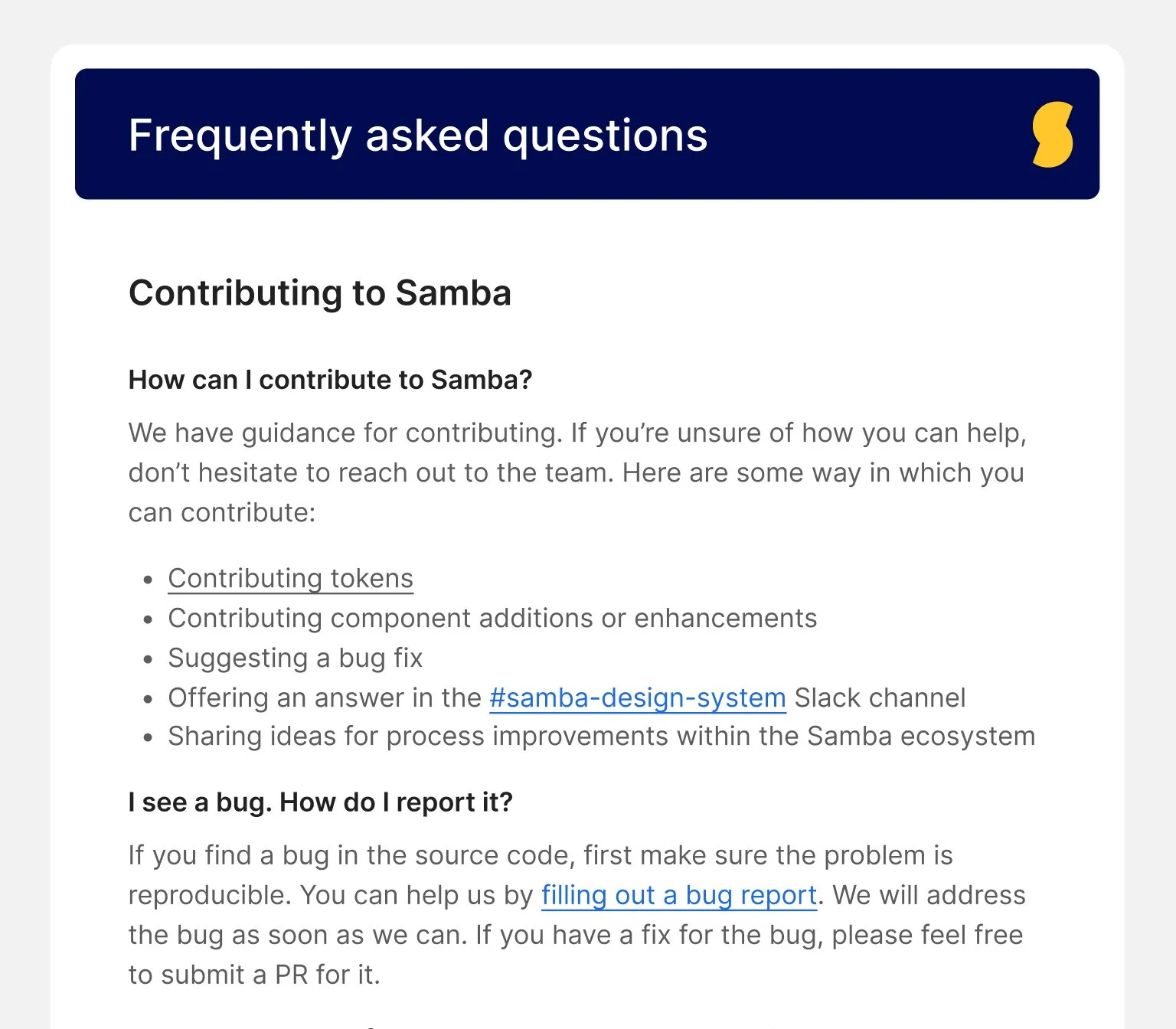
After announcing the publish of Samba to the design and engineering teams, people, of course, had questions about how this release would impact their workflow.
These questions came through our Slack channel, in which I logged them and prepared a list of FAQs along with answers.
What about the other libraries? Do we use them if Samba is missing something?
I see a component that I think should be in the system. How do I contribute?
I need to build something but Samba doesn’t have what I need. What do I do?
Samba is for React components. What if the build is Rails or Flutter?
How can I tell the difference between Samba components and other components?
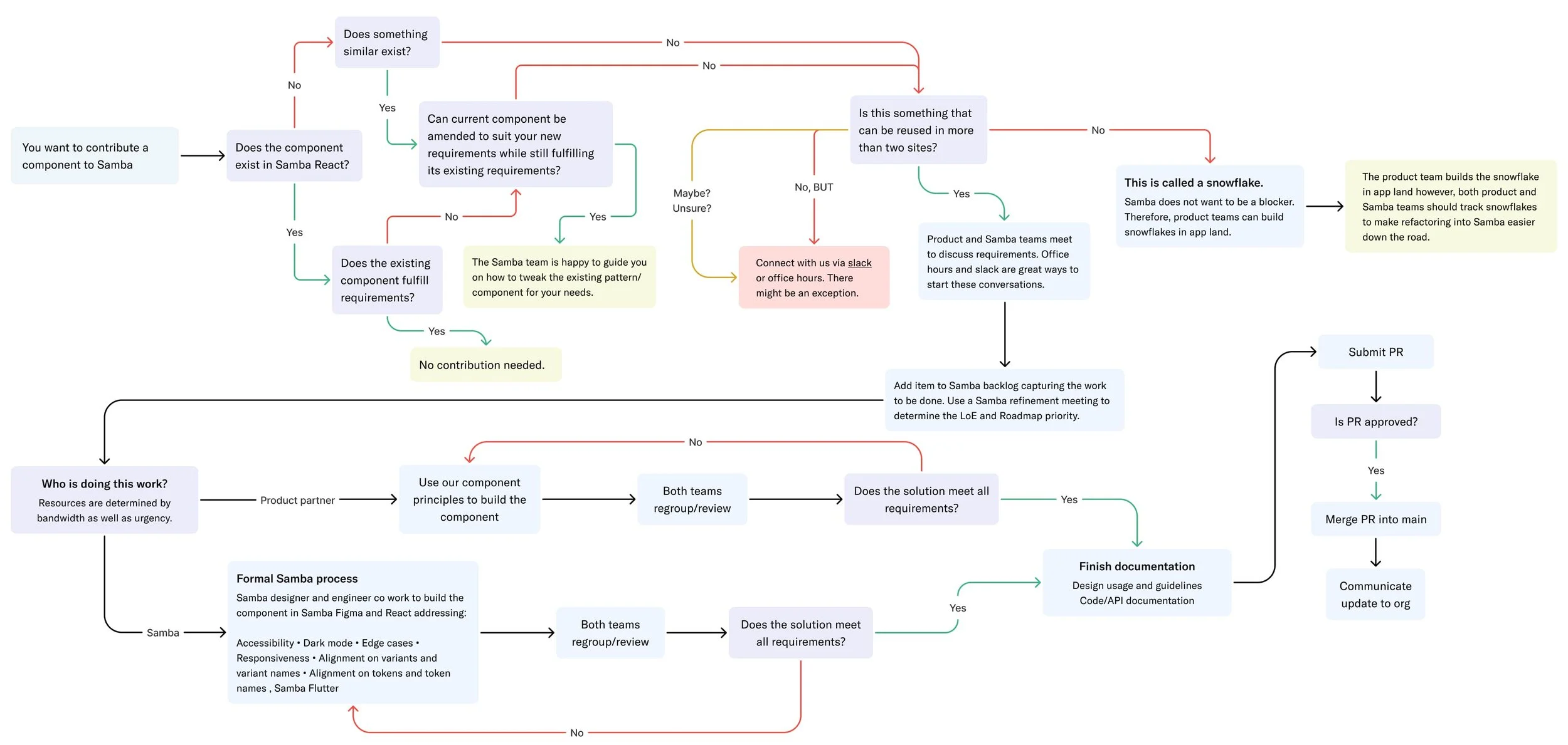
We had no official governance process
With the new system in everyone’s hands, people were excited to use it, but we underestimated the engineering appetite to contribute to the system. We ran into some tension when some engineers submitted PR’s for new components, but were disheartened when those PR’s were rejected by platform engineers.
As a team, it was important to agree on how to handle these situations. But without a proper governance process, it was just the Wild Wild West.
The solution
Guide engineers and designers on component requests by providing a governance process and other educational resources.
Thank you, Brad Frost!
I started looking into design system governance processes and came across a Brad Frost article. He referenced a governance process that I felt would be useful for my team with some minor adjustments. I used this as a basis for my team’s governance process.
Interviewing engineers
I interviewed engineers who submitted PRs that were rejected. I also interviewed engineers who rejected the PR’s. I was able to understand information that would’ve been helpful upfront for both sides to decide how this could’ve been handled differently.
Better Communication

Samba office hours
I started an office hours meeting to answer any questions designers and engineers might have about how to use the system.

Communicating with Symbols
I used emojis to help designers understand the difference between approved and deprecated components.
Documenting FAQ’s
I created FAQs documentation in Figma for designers and built MDX pages in Storybook for engineers.

Governance process
I established a governance process to guide designers and engineers on component contribution.

Linking out to code bases
I used the component description field in Figma to document usage guidelines and links to code base equivalents.

Design and Engineering Walk-through
I partnered with my platform engineer to give walk-throughs of the new design system to other teams.
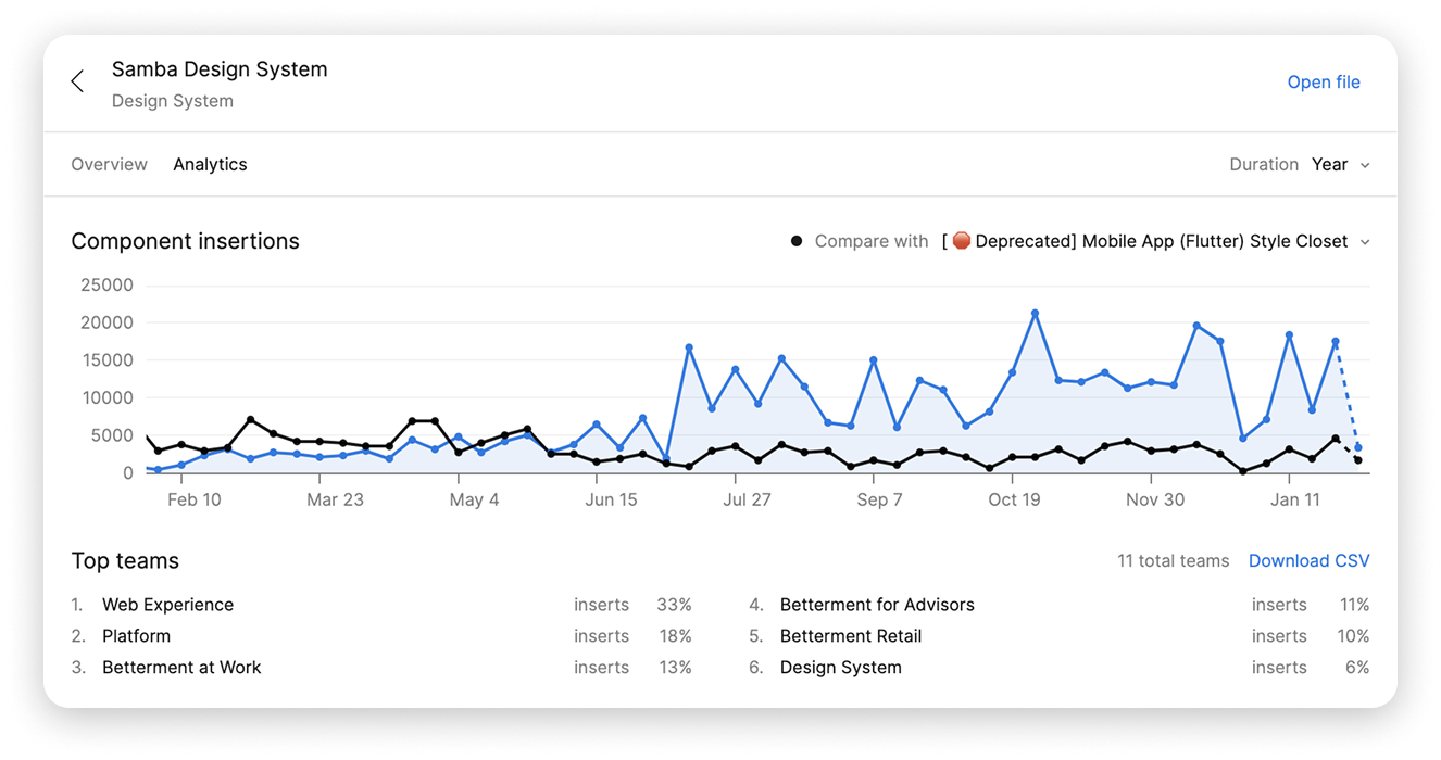
Tracking usage
After releasing the system to the design team, I started to see usage of Samba increase and usage of other libraries decrease. I started to prepare to fully un-publish the other libraries in efforts to increase adoption of the new library.


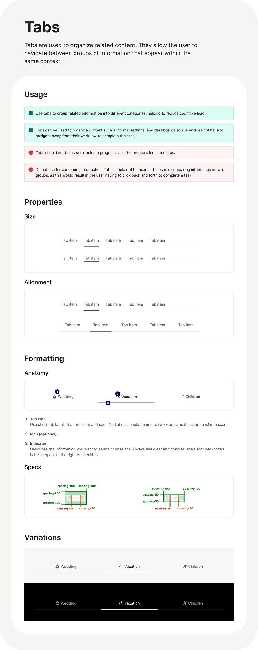
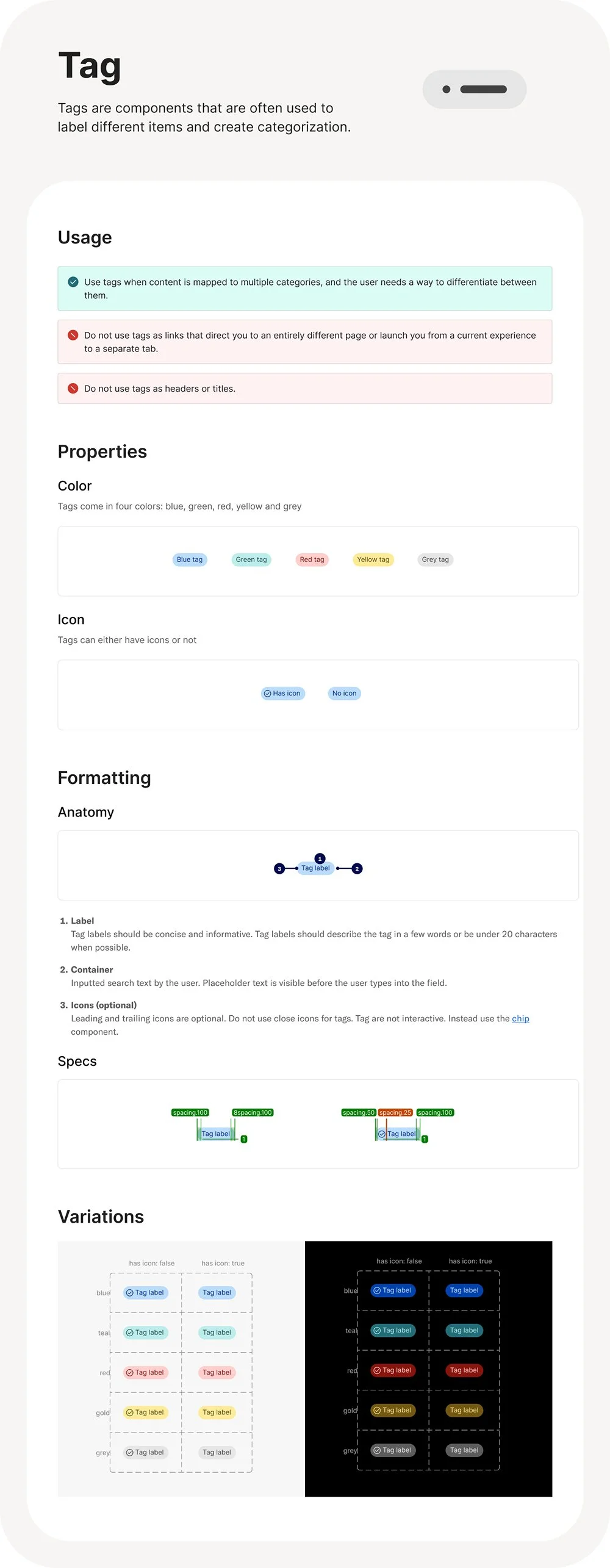
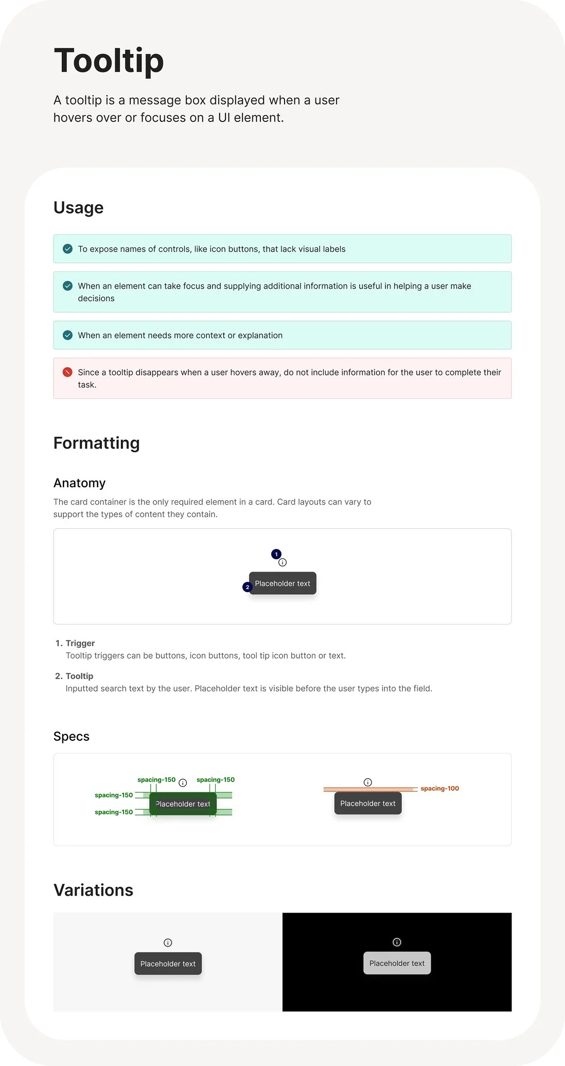
Page design templates
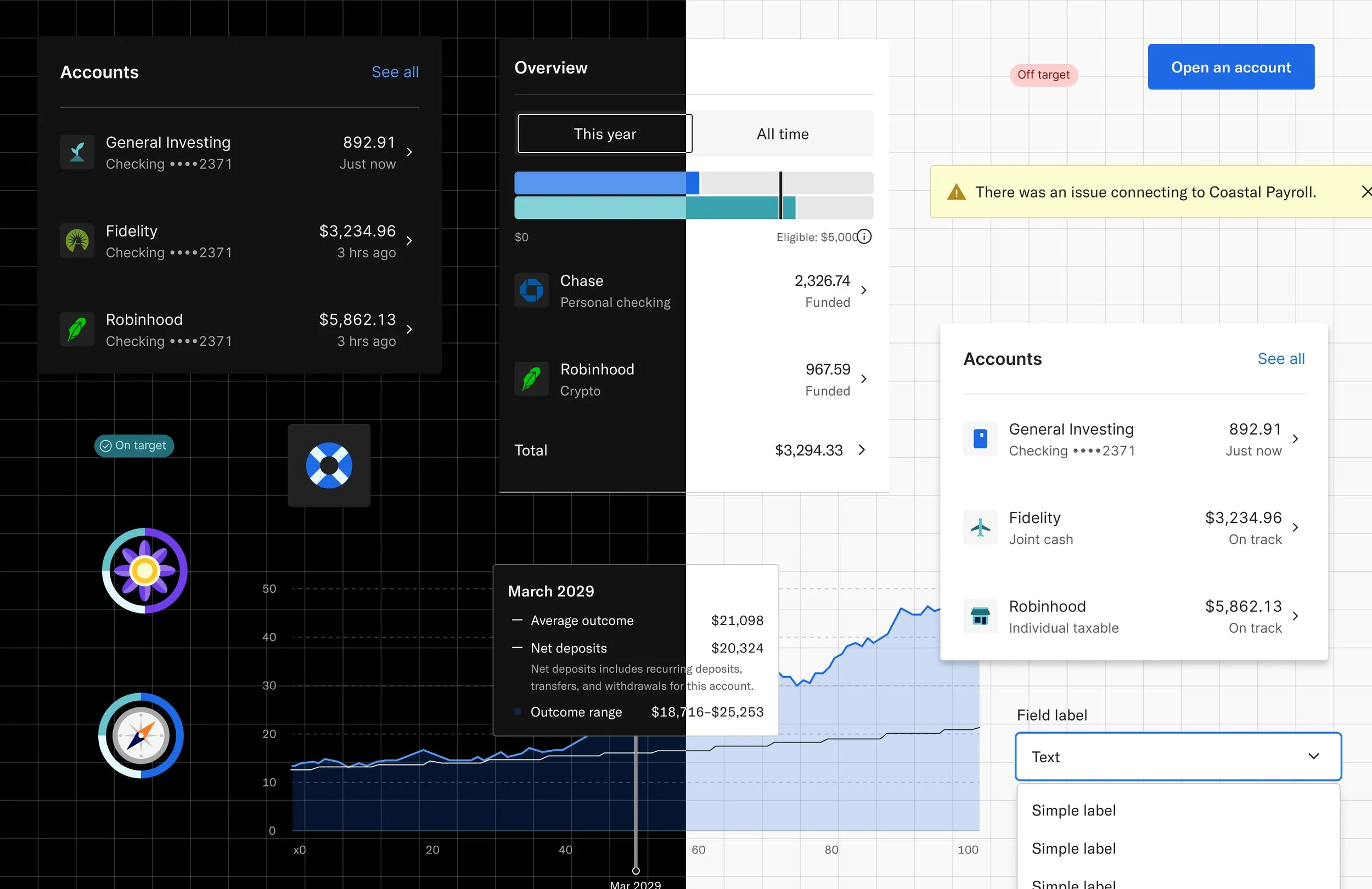
Design systems don’t just stop after the components are created. I found ways to add more value to the system. During the company-wide Hack-a-Thon, I collaborated with the design team to create templates of their most frequently used screens. These templates were built 100% from Samba components and were published for use.
These templates cut down on many of the copy-and-paste issues designers were facing, reduced inconsistency across designs, and reduced the time designers spent either creating or searching for screens.
Lessons and impact
Process increases morale
When dealing with a team that has a healthy appetite to contribute to the design system, it is crucial to document the governance process. Having a process saved us a lot of disagreements and stalled PR’s and really got engineers excited working with our team.
Overcommunicating is a good thing
Whether it was FAQs, design documentation, tutorials, or links to video walkthroughs, providing multiple ways for people to get the answers they needed increased efficiency across teams and the org’s trust in our team.
Design systems are a tool…Not a rule.
They are meant to be a guide that encourages creativity instead of hindering it. The tone in how the system was presented mattered. Including engineers/designers in the creation of this system and creating feedback loops that promoted candid conversations between them made everyone feel empowered to contribute ideas on how to improve the system, rather than just working within its boundaries.
Design systems are more than just components.
Extending the system beyond components was a huge support to designers. I found ways to add more value to the system by creating screen templates for designers. I was able to show how powerful the system can really be.
Advocating for both design and engineering
As a designer who was not only on the platform team, but also embedded within the design team, this allowed me to act as a liaison between design and engineering, advocating for both sides. I was able to understand when designers would need flexibility and when it would be important for the system to take a stance.