Angelou Design System

Angelou is Newsela’s evolving Design System. Product and technology work together to provide reusable and fully accessible UI components and design resources for use across our growing number of applications.
Role Lead product designer
––––––––––––––––––––––––––––––––
Company Newsela
––––––––––––––––––––––––––––––––
Team 1 a11y engineer, 2 Front-end engineers, 3 designers
The problem
There are inconsistencies between the React library, Figma, and the live site.
Upon joining Newsela, I appreciated the fact that there was a design system. However, I noticed major discrepancies between what existed in Figma vs Storybook vs the live site. Things went unchecked for quite some time, which resulted in tech and design debt. I met with designers and engineers to understand pain points with the current design system and the company’s historical approach to systems.
Components were created blindly
Components were being created based on what other design systems across the web were doing. They weren’t based on the needs of our users.
Value of design systems was underestimated
The company’s strong focus on work related to new features made it difficult to understand the value of internal products such as design systems.
Lack of resources
Due to leadership not seeing the design system as a priority, the team had limited resources.
Responsibilities weren’t clear
Leadership saw the design system as a design system team problem, not an org problem. Therefore, other teams weren’t encouraged to contribute.
Solution
Create a SoT Figma library that will promote productivity and consistency among the Product Org.
Step 1
Creating awareness
In efforts to create visibility into what the design system team was going to be working on, I used cross-functional all-hands meetings to share this project initiative and the impact on each cross-functional group.

Impact on engineers
The goal was to update the current React library. We had no plans of creating a new library. We wanted to clean it up and add to it to make engineers’ lives easier.
Impact on PMs
To avoid scope and timeline concerns, we made it clear to PMs that the goal was not a redesign. Instead, this was considered clean-up and tech debt.
Impact on designers
I wanted to create a new SoT Figma file for the design system that will be published regularly to the design team and will promote design consistency.
Step 2
Conducting the audit
I kept the scope of the audit to the live site and the React library. I outlined a process for a visual audit. Myself, along with two other designers, divided and conquered and carried out the audit. We worked in a joint Figma file to collect screenshots and take notes.

Colors
There were many different blues, greys and blacks. They looked similar to the naked eye but upon using the inspect tool, I noticed a lot of different hex values. In addition to having multiple values of the same color, there was no logic behind their usage.

Typography
Even though there was consistency with the font families (Noto Serif and Circular) there wasn't much clarity on when and how these fonts should be used. Sometimes a serif font was used. Sometimes a sans-serif font was used. No rhyme or reason as to why.

Buttons
Buttons were a core component and I couldn’t help myself but to include it in the audit. I noticed inconsistencies in corner radiuses and sizes. There were times when competing prominent buttons were paired with each other. Some buttons were positioned next to elements that looked like buttons but weren’t actually buttons. There were also buttons that didn’t pass contrast ratios.


Visual exploration and brand integration
While we were working on the design system, the design org got a push from leadership to integrate more brand elements, such as brand colors and illustrations into the product. This meant extending our color palette and providing guidance on how to inject branded elements into the product intentionally.

Pulling it all together
I worked with my platform engineers to populate our backlog with tickets to help us prioritize and track components and updates. We prioritized based on dependencies, level of effort, and product needs.

Angelou 2.0 was created
We designed and documented the components and created tickets in our backlog for engineers to tackle the React implementations.


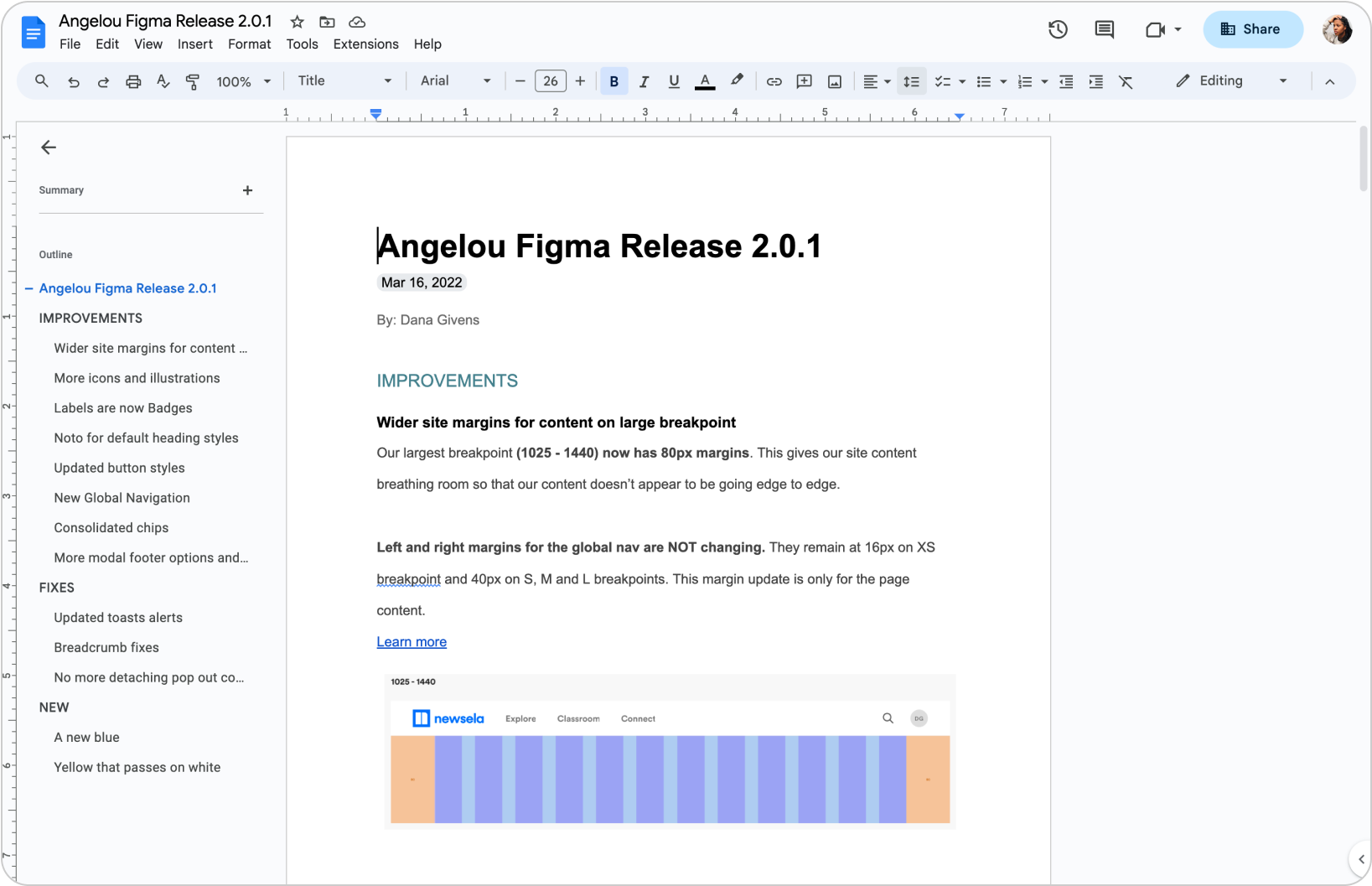

Releasing Angelou 2.0
I created release notes to go along with the new Figma system. It was released to all 11 teams (about 13 designers across the teams). I set up a bi-weekly office hours as well as working sessions to help designers update their recent files to the new system. I monitored the usage for the first month.


First month activity
In that first month I saw usage metrics totaling 11K instances. However, I noticed a significant amount of detaches across some of our most frequently inserted atomic components. I had a plan for the next release.
21 components launched
The systems team designed and documented the most used/needed components and included them in our first Figma release.
~11K instances 📈
Across the 13 designers using the library, a little over 11k instances were present within the first month. This was great internal usage.
82 detaches 😱
I saw a total of 82 detachments across 6 major components. After digging into the designs, I noticed variants that weren’t accounted for in this first release.
Adding variants
After seeing the number of detaches across components, I spoke with designers to understand the reason behind these detaches.
I learned that some components were missing variants and props. I put design tickets in our backlog to create more variants and props for the designers’ needs.

Next month release
In the next release, I saw an increase in instances and a decrease in detaches, which let me know the design system was a success and the variants supported designers’ needs.
6 new components
Over the course of the first month, I noticed designers reusing custom-created components across multiple files and teams. To make their lives easier, I included these in the next Figma release.
~19K instances 📈
In the next release, I saw about 8K more instances. This was partly due to new teams being created as well as new components being added to the system.
Decrease in detachments
While component usage increased, detaches went down from 82 to 17. This showed that the updates made to the system were valuable.
But our engineers were backlogged
We had 2 engineers working on React updates and an A11y engineer who was assisting them with reviewing ARIA roles, keyboard navigation, and screen reader support. But our engineers were stretched thin and were not able to build the components as fast as we were able to design them.
Design system advocacy
Advocate for engineering resources by helping leadership understand the value and impact of a design system.
Tech debt culprits
With the new system now available, platform engineers were hard at work trying to update the React equivalents, but without fully dedicated resources, this was difficult. I put together a presentation showing the benefits of design systems as well as the paths that are leading to the design and tech debt the team was facing.

More eng resources
Presenting the design system and its benefits to the product org leadership helped us to secure more engineering resources.
Squad roadmap planning
We alerted PMs and engineering managers of refactoring that was needed on their repos. We worked closely with PMs to make sure refactoring tickets were added to their backlog.
More hands on deck
We worked with design leadership to implement a rotating engineering schedule, which allowed engineers from product teams to contribute to and become familiar with the design system.